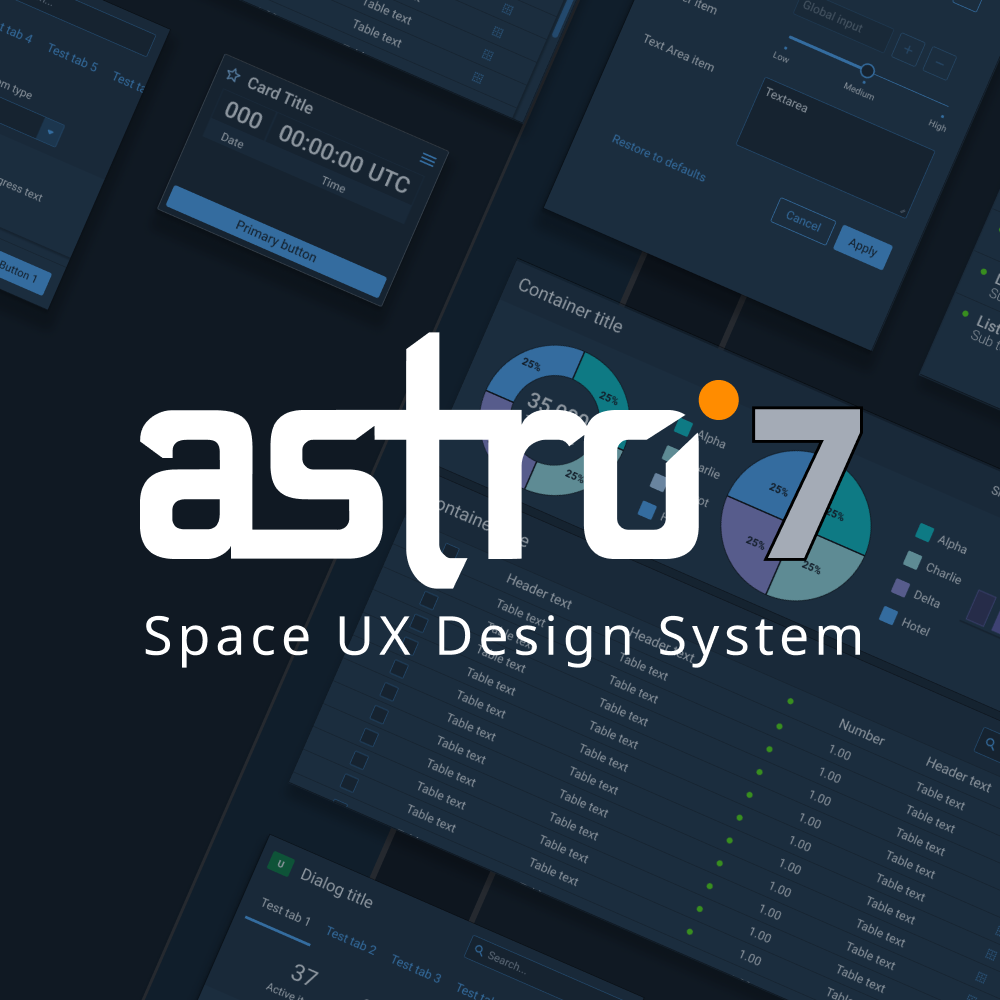
Astro UX Design System
VERSION 7 RELEASED OCTOBER 2022
The Astro UX Design System (Astro UXDS), created and stewarded by Rocket Communications, enables consistent development of rich applications for the United States Space Force. Developed using best practices and established interaction patterns, Astro’s guidance and components are based on user-centered research into the functions and capabilities required for applications used in space-based operations.
THE PROBLEM
After years of on-and-off focus and support from varied design and development teams, Astro UXDS had become cumbersome and inconsistent. UI designs didn’t match implemented applications, and there was frustration amongst designer, developers, product owners, and customers. The next generation of Astro UXDS was to be updated using modern development techniques, but this meant undoing years of design and technical debt, redesigning and re-architecting the components to be more scalable and usable for future application systems.
THE SOLUTION
A dedicated team was devoted to developing the next generation of Astro UXDS. Astro 7 needed to be a modern design system that worked equally well for designers and developers, so that applications could be built consistently across a multitude of organizations, companies, and clients.
MY ROLES
In addition to helping strategize and define the next vision for Astro 7, I set and managed design roadmaps. As a Project Lead, I was responsible for coordinating design team activities in conjunction with development team implementation. Keeping the teams informed and in sync with each other was key to successfully building a design system that worked for both teams.
THE PROCESS
To start, the core foundations of the design system were revisited – color, spacing, and typography. All were reviewed, adjusted, simplified, and standardized. From this foundation, each individual component was then redesigned from the ground up using the new structure, making them more consistent, scalable, and flexible.
Moving Astro 7 to a design token framework that defined all colors, variables, and usage patterns enabled this process to move quickly and efficiently. Tokens were implemented across both Figma components and implemented web components, so that both designers and developers would be working with a consistent set of tools to create engaging experiences.
The use of design tokens enabled development of Dark, Light, and Wireframe versions of the Figma library and corresponding web components. The components could also be scaled as needed, and new components could quickly be added to the library.
Another important consideration was that Astro UXDS was quickly adding new users. To help enable this growth and quickly get up and running, getting started documentation was written both online and within the Figma libraries. Common examples of each component were added to the Figma libraries, which enabled designers to quickly copy and paste them into new UIs and get started with a minimum of effort.
THE RESULT
The Astro 7 launch was incredibly successful. Astro 7 downloads very rapidly tripled the previous version, and user satisfaction and engagement improved. Perhaps most importantly, the coordination and collaboration between the design and development teams led to an incredibly vibrant, creative, and engaging working environment. This shows in both the quality and quantity of work that was produced for the rollout of Astro 7.
ARTICLE
Medium article discussing the reworking of the Astro UXDS color system.
http://medium.com/astrouxds/reworking-a-color-system-for-flexibility-and-growth-35e950091a2a


